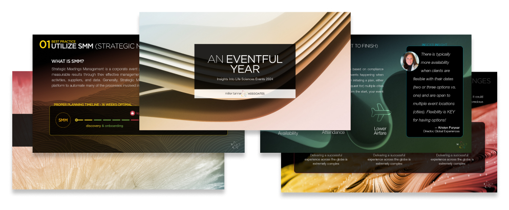
In any presentation, as meeting experts, we know content is king. In today’s meeting room, you want to make sure that you showcase your content in such a way that it is visually engaging and provides a dynamic experience for your learner.
That being the case, it may be time to upgrade your PowerPoint slides from 4:3 layout to the modern, widescreen 16:9 layout.
Why Switch Formats?
Widescreen, a 16:9 ratio, is rapidly becoming the new standard in modern screen display. Even as we speak, you are likely working from a laptop with a 16:9 aspect ratio or have a television with the widescreen ratio. The 4:3 format (1440 x 1080 pixel resolution) is known as the standard aspect ratio, and 16:9 (1920 x 1080 pixel resolution) is commonly referred to as widescreen. With so many changes in technology, widescreen has rapidly become the standard these days, and what was previously the standard is becoming obsolete.
When you produce a PowerPoint, for example, the latest iteration of Office now defaults to the 16:9 format as a blank template (since Office 2013, in fact). You can, of course, still switch to 4:3 (the now older and less standard format), but there are only certain applications where you’d need to do that which we’ll discuss later.
Benefits of 16:9 Slide Format
The reality is, what you might lose in height of a slide you gain in width, so though you’re rearranging your content, you’re not losing too much. In fact, height for height you gain more content space, which should be a great thing for those “inclusion/exclusion” slides.
Another benefit is that you can keep the same area of screen, while having the screen higher up. For instance, this would work well in a low ceiling hotel meeting room. Sticking to 4:3 ration in a low ceiling space means making the screen much smaller to lift the bottom edge into view.
So when would you NOT need 16:9 ratio?
If you do presentations from your iPad, you might want to use a 16:10 ratio slide. If you were working in one of the old hotels I mentioned, then you might do 4:3 (though you could do 16:9 in most cases). However, your starting point with all these should be 16:9. If you run a 4:3 presentation on your 16:9 laptop, quite frankly it doesn’t look great on a number of levels.
Unfortunately, some may have Office 2010, which defaults to the older format 4:3. which can be changed to 16:9.
Miller Tanner Can Help
Within MTA’s Media and Production Team, nearly all our new equipment conforms to this new standard of 16:9, as it is becoming harder to source 4:3 screens, projectors, or TVs.
One of our tech team’s jobs is formatting presentations, so our team can resize slides to 16:9 or design your template at the beginning. With just a little advanced planning, our team can format to widescreen. Otherwise, you may end up with pillars or letterbox bars.
While the tendency to stick with 4:3 format might be preferable to some presenters who fear changing the content, our team can assist to ensure the format changes preserve the message while also fitting the screen to achieve the presentation goals.
Our Media and Production Team can help you achieve your presentation and audience engagement goals. Contact Miller Tanner Associates to find out how we can support your next event!
- Meet MTA: Steven Garberg, Software Engineer, MTA Technology Services - September 15, 2020
- Case Study: How a Hotel Contract Cancellation Clause Resulted in Zero Penalty During Pandemic - August 20, 2020
- Virtual Events: Frequently Asked Questions - August 11, 2020


